True Colors Rebranding: Strategy and Creative Development of New Name, Logo, and Brand System
The True Colors Fund needed a new name and logo, since their name was misleading (they don’t fund other organizations) and their logo didn’t help them stand out from other nonprofits. After convincing my agency’s C-suite to take on the work, I led the strategy phase as well as the creative development. For the strategy phase we researched TCF’s existing brand equity utilizing social listening, search analysis, and consumer behavioral analysis of relevant audiences. We then used the strategic direction as a guide for the creative development. Once the client signed off on creative assets I also helped direct their launch of the new branding on their social media account as well as introducing it to donors via email.
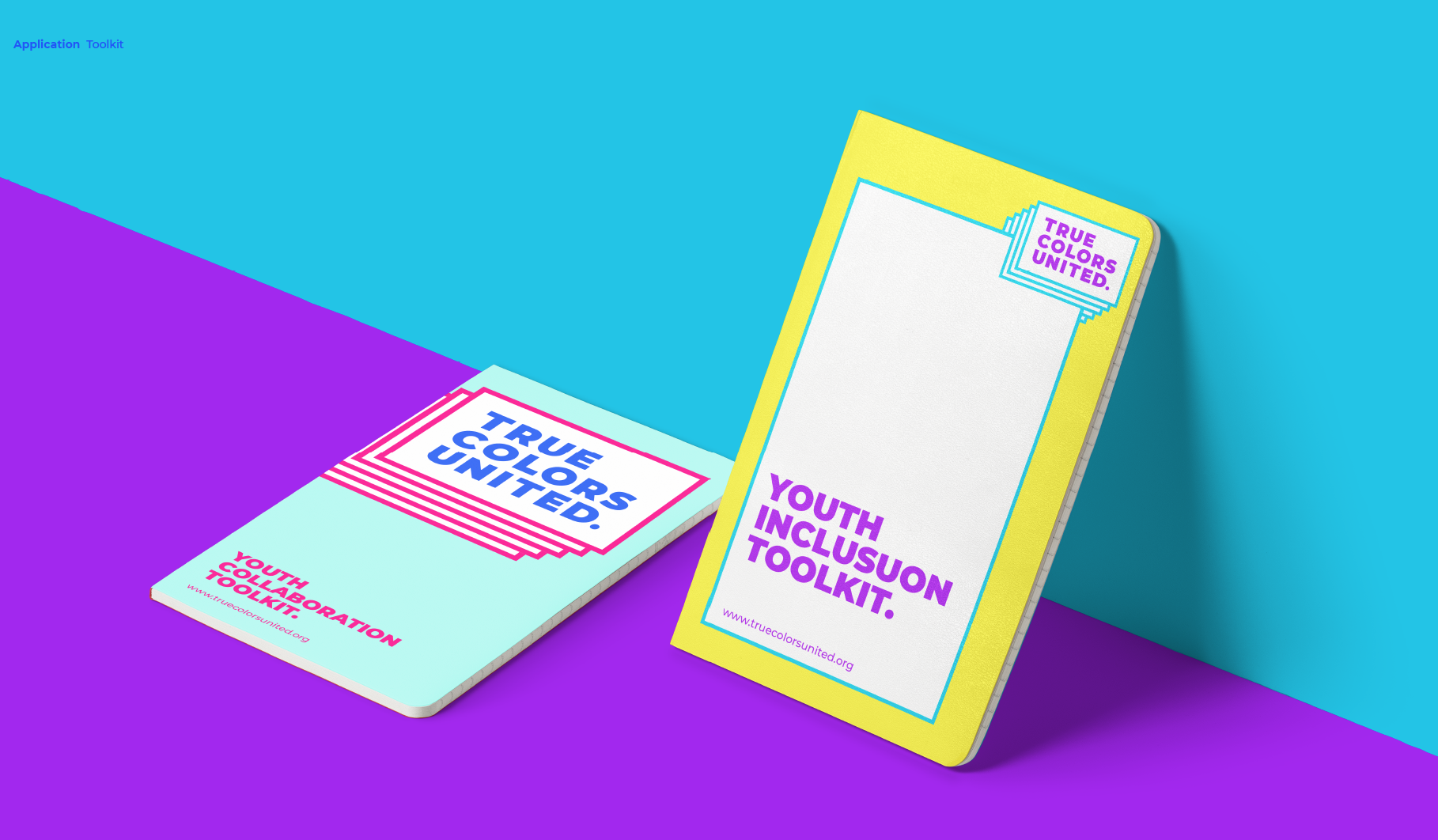
The new name “True Colors United” as well as the tagline “Getting LGBTQ Youth Home” eliminates the confusion generated by the old name, and also achieves the desired brand positioning. The logo itself is also an unorthodox approach to branding: it uses a range of color versions to highlight the value the organization places on diversity and expression.
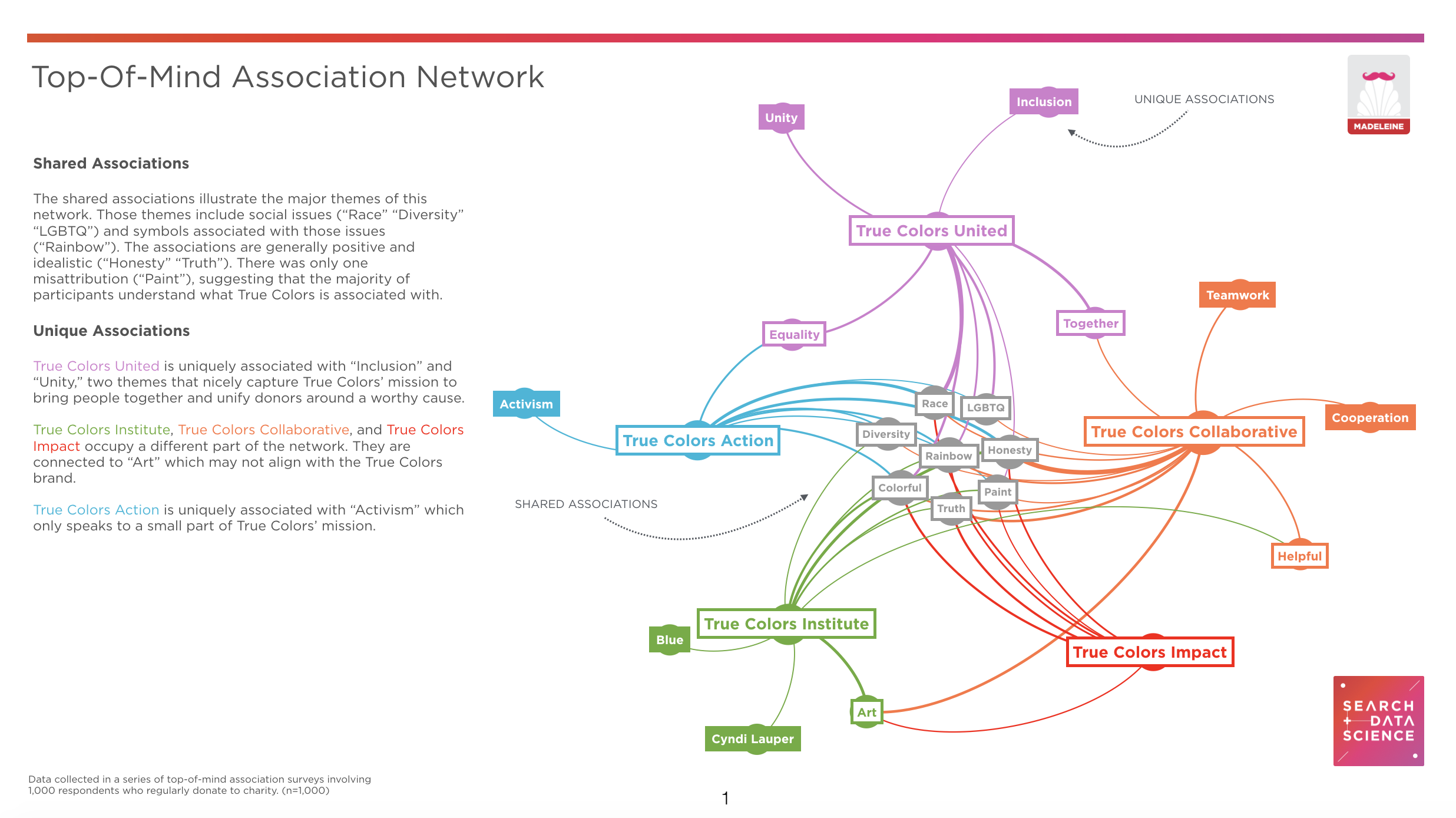
Below are some results from the audience testing and social listening we did as part of the strategy phase.


